Ash Smith Art
"Beauty is nothing other than the promise of happiness" -Stendhal
Wednesday, September 26, 2012
Friday, August 3, 2012
3DS Max Renderings
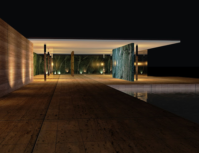
This summer I took a class in 3DStudioMax, a rendering software that let me make these beautiful interior and exterior images of my digital model. The first three are from my Whitney Museum "Space of Reflection" design, and the last four are renderings of the Barcelona Pavilion.
Thursday, December 29, 2011
Best Christmas Present
My Dad is virtually impossible to buy presents for, every year my sister and I agonize over what he might want, need, or even just laugh at. The problem is, he never reads any books, my mom already buys all of his clothes and accessories, and as for hobbies his is tinkering with his boat so your best bet would be some esoteric engine part. Thus, we are left trying to think of things that might at least make him laugh, and this year I think I nailed it.
For as long as I can remember, my Dad has been opining about a theoretical book that he would like to write. I think it began around the time that my sister was looking at colleges, and he would accompany on her on campus visits. Sitting in these admissions offices, what he noticed most were the pairs of daughters and mothers: while some mothers and daughters were virtual carbon copies, others looked like a Playboy Bunny accompanied by Jaba the Hut. What if, he mused, there were a book where one could look up their girlfriend and cross-reference her image with that of her mother, predicting how she might age in 5, 10, 15 years. Essentially, it would answer the eternal question of whether the juice is worth the squeeze.
Now he still hasn't gotten around to writing the book, but I have designed a cover for it whenever he does:
How to:
Choose a book to cover, I wanted a hard cover book so I picked an old one I don't read. Measure the height of the book, and then the length of both covers and the spine, then add a few inches to the length for the flaps. Make a photoshop document that is the height of the book and the length of the flaps, covers and spine altogether.
Now, picture how the jacket wraps around the book, the back cover is on the left, the spine in the center, and the front cover is on the right. Put some Guides into your document demarcating where the flaps, covers, and spine should be.
Now is the fun part! Use whichever images you want, and add some fun text. I googled images of actual books to get ideas on where the text should be. I also put an "Oprah's Book Club" sticker onto the cover and a barcode on the back cover for a touch of authenticity. Both were simply a googled, downloaded, and pasted in.
I printed it on a plotter at Pratt, so I didn't really have a choice but to use a heavier weight paper, but I would definitely recommend it.
Once its printed, just wrap it around the book, carefully creasing at the edges of the covers and spine.
Voila! A personalized book cover.
For as long as I can remember, my Dad has been opining about a theoretical book that he would like to write. I think it began around the time that my sister was looking at colleges, and he would accompany on her on campus visits. Sitting in these admissions offices, what he noticed most were the pairs of daughters and mothers: while some mothers and daughters were virtual carbon copies, others looked like a Playboy Bunny accompanied by Jaba the Hut. What if, he mused, there were a book where one could look up their girlfriend and cross-reference her image with that of her mother, predicting how she might age in 5, 10, 15 years. Essentially, it would answer the eternal question of whether the juice is worth the squeeze.
Now he still hasn't gotten around to writing the book, but I have designed a cover for it whenever he does:
 |
| Front Cover |
 |
| Back Cover |
 |
| Spine |
Choose a book to cover, I wanted a hard cover book so I picked an old one I don't read. Measure the height of the book, and then the length of both covers and the spine, then add a few inches to the length for the flaps. Make a photoshop document that is the height of the book and the length of the flaps, covers and spine altogether.
Now, picture how the jacket wraps around the book, the back cover is on the left, the spine in the center, and the front cover is on the right. Put some Guides into your document demarcating where the flaps, covers, and spine should be.
Now is the fun part! Use whichever images you want, and add some fun text. I googled images of actual books to get ideas on where the text should be. I also put an "Oprah's Book Club" sticker onto the cover and a barcode on the back cover for a touch of authenticity. Both were simply a googled, downloaded, and pasted in.
I printed it on a plotter at Pratt, so I didn't really have a choice but to use a heavier weight paper, but I would definitely recommend it.
Once its printed, just wrap it around the book, carefully creasing at the edges of the covers and spine.
Voila! A personalized book cover.
Tuesday, December 13, 2011
M(ad) Men Now
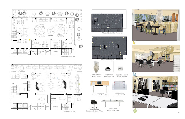
For the final Studio project of the semester, I designed an office space for a newly formed advertising and branding agency, focused on the needs of the Fashion Industry. The firm is comprised of 45-50 employees, and headed by 3 directors. The clients had selected a space in the Pepsico Building, at 500 Park Avenue, on the 10th floor and the Penthouse floor.
In considering the needs of the modern workplace, facilitating communication was at the absolute core of my concerns. Inspired by a TED Talk on biomimicry, and the notion that we don’t need to remake the wheel when we can look to the highly evolved design solutions in the world around us, I looked to a solution in neuroscience.
Inside your brain, communication of information and ideas between neurons happens in spaces called synapses. Using a neuron as a model, I proposed that each of the directors were nucleus of their own departmental neurons, and what they needed was a “synapse space” where these different departmental "neurons" could communicate.
In the final design, this synapse space became the Inspiration Library, a stair and bookcase combined unit, where ideas and people flow between departments (and floors). Here all the senses are stimulated into making new and innovative connections by books, iPods, DVDs, Materials, Artifacts.....
The Inspiration Library also offers an opportunity for the employees to personalize their workplace experience by changing the displays within the bookcase to reflect their latest projects or personal passions. It drew inspiration from the staircase at the Chanel Flagship in Paris.
Materially, I drew on the firm’s Fashion Industry clients to put together a conceptual palette in a leather and mirrored jewelry box, strewn with pearls, a sheer scarf, a ladies glove, and my tigers eye egg. This palette served as my guide in determining the finishes.
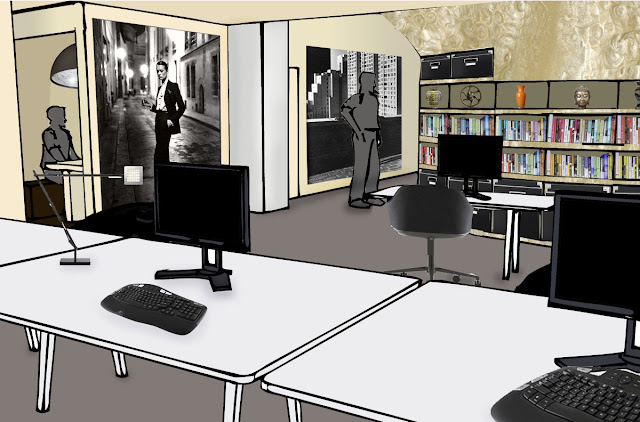
Since the general public (aka my friends and family) can't really read floorplans or reflected ceiling plans, I'm going to skip them and jump to showing you perspectives inside the space:
View from Creative Department towards Inspiration Library and Focus Alcoves
View of Inspiration Library, into War Room
View of Inspiration Library Upstairs Where It Adjoins the Cafe and Reception
Saturday, December 10, 2011
Beautiful Redesigned Book Covers
I am swooning over these redesigned book covers....gorgeous.
I love the color schemes...the patterns...
Portfolio
As my semester coasts to a close I've started the process of documenting. Check it out, and help me out with any constructive criticism:
Monday, November 14, 2011
Dr. House
During college, my roommate used Dr. House as her subject for a long psychology paper- and in the process we watched every single episode at least once. So, taking a page from her book- I decided to use Dr. House as inspiration for the design of my new studio project, an office!
If you've ever seen an episode of House you know that there are two factors that are always present in his problem solving process. The first is the use of a dry erase board to brainstorm ideas. In a recent episode, House even found a way to turn a glass curtain wall into a dry erase board- flexible, dynamic brainstorming at its best.
The other factor that is always present in House's problem solving, is seeking inspiration throughout the hospital. In almost every episode Dr. House ends up observing someone in the hospital and then bam, inspiration hits when he realizes that someones toupee has reminded him of a novel genetic disorder.
Even out of the hospital context I think that these problem solving strategies are something that could be useful to think about in designing an office for any discipline. Brainstorming in a way that puts all the possibilities visually in front of you, and in front of your peers for input- and seeking inspiration through novel stimuli, are ideas applicable to a wide range of businesses.
Subscribe to:
Comments (Atom)


